How to Optimize Images on Your Website for SEO and Performance?
In this article, we will explore the impact of images on our website’s performance and strategies for optimizing them for SEO. Let’s delve into the details.

Optimizing the images we add to our website is a crucial metric for both the performance and SEO (Search Engine Optimization) aspects of our website. An unoptimized website with images can experience noticeable performance losses. Let’s explore how we can optimize our images step by step.
Adding a Descriptive Alt Tag to Images
Let’s start by addressing the question, ‘What is an alt tag?’ The alt tag can be considered as an alternative description for our images. In this context, we should provide a description for most of the images we add to our site. Pay attention to the word ‘most’ here; we will explain this in the later parts of the article. When writing this description, imagine describing the image to someone without showing it to them. For example, consider an image like the one below.

An appropriate alt tag for this image could be one of the following:
- A robot drawing a picture.
- A robot drawing on a canvas.
Of course, you can further detail this based on the image, but, in general, we should add descriptions like these to our images.
Should We Add Descriptions to Every Image?
The short answer to this question is no; the descriptions of some images may be empty. Why?
We mentioned that our images are pieces of our content, but not every image may be a part of our content. Imagine you have a florist website, and during an explanation about a particular flower, you might have a rose image placed in the design of your website, independent of the content you’re discussing. Since this image is unrelated to our content, we can leave its description blank.
In a more general sense, think about reading a blog post from your website to a screen reader (you can even do this as there are browser extensions, etc.). The screen reader will read the descriptions you’ve added to the images while reading your content. If you add a description to an image that is unrelated to the content, the screen reader will read it, potentially creating a poor experience for the listener. For more detailed information on this topic, you can visit https://www.w3.org/WAI/tutorials/images/decision-tree/.
Benefits of Adding Alt Tags to Images
The benefits of adding alternative descriptions to our images are as follows:
Facilitating the crawling of our website, providing a more accurate description of our content.
Adding alternative descriptions to our images makes it easier for our website to be crawled by search engine bots. It can also enhance visibility in image searches.
Readability by screen readers.
One of the most important and beneficial aspects of alternative text is this. As mentioned in the section ‘Should We Add Descriptions to Every Image?’, it allows users who rely on screen readers to understand your content more accurately, contributing to a more accessible website. 🙂
Providing accurate feedback to users when the image fails to load.
Sometimes, images may not load due to connection issues, etc. In such cases, browsers display the alternative text when they can’t show the image. This provides users reading the content with an idea related to the image.
How to Add Alt Tags?
There are various ways to add alt tags to images, let’s explore them.
Editing HTML Directly
To add alt tags to images on your website, you can directly edit your HTML tags. An example is as follows:
<img src="https://siteobserver.co/robot.png" alt="A robot drawing a picture"/>
As seen in the example, by adding alt=”A robot drawing a picture” to our img tag, we have provided a description for our image.
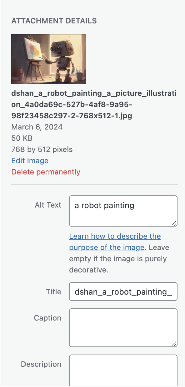
Via WordPress
If your site is built on WordPress, you can add an alt tag to your image by filling in the ‘Alt Text’ section when uploading the image, as shown below:
Optimizing Image Resolutions
High-resolution images mean larger file sizes. Larger file sizes result in slower loading times for your site, leading to a decrease in performance. In this context, we should adjust the resolutions of the images on our site based on their intended use to avoid these issues.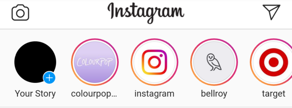
For example, let’s consider the Instagram application. Every time we enter the app, we see people’s profile pictures in the stories section at the top. This area has been designed with dimensions of 56×56. If we place 1024×1024 images in such an area, we unnecessarily and dramatically reduce the performance of our website. In this context, we must ensure that we correctly adjust the size of every image we add to our site.
So, how can we adapt to every screen resolution? For instance, an image adjusted for desktop resolution will naturally appear large on mobile. Let’s discuss this in the next section.
Providing Appropriate Images for Different Screen Resolutions (Srcset)
We discussed the importance of resolution in the previous section, but by loading the image in a single resolution, we cannot achieve compatibility with all devices (desktop, tablet, mobile). Especially in the mobile version, where the screen is very narrow, most of the images we upload will be too much for mobile.
To solve this problem, our srcset feature comes into play. With this feature, we provide the browser with different-sized versions of our image and let it choose based on the screen size. Usually, the browser selects the image with the resolution closest to the current screen resolution. This way, we avoid unnecessarily loading high-resolution images.
How to Use the Srcset Feature?
The example srcset code is as follows; as you can see, I uploaded three different images (1920px, 768px, and 300px wide) and specified their widths to the browser. Now, when the page loads, our browser will choose the most suitable image based on the screen size and load it. However, if you notice, I also put an image in the src field. The reason for this is to specify the default image to be shown if our browser does not support the srcset feature. But nowadays, all modern browsers support this feature.
<img srcset="https://siteobserver.co/robot.png-1920.jpg 1920w,
https://siteobserver.co/robot.png-768.jpg 768w,
https://siteobserver.co/robot.png-300.jpg 300w"
src="https://siteobserver.co/robot.png-1920.jpg">
Optimizing Our Image File Sizes
Reducing the file size of our images by lowering their resolutions may not be enough for optimization. Many images may still be larger than necessary due to insufficient compression or the use of outdated image formats. Let’s explore ways to optimize this.
Compressing Images
Before uploading images to our website, we can significantly reduce their size without compromising quality by using compression algorithms. While various tools exist for this purpose (some content management systems like WordPress perform this task automatically during image uploads), you can use TinyJPG (https://tinyjpg.com/) to compress an image online. For example, when I compressed an image using this tool, I achieved a 54% size reduction, contributing to a faster and more efficient website performance.

Usage of Next-Gen Formats (WEBP)
Another way to reduce the size of images is by using the .webp format, which is owned by Google. Google also recommends this format in PageSpeed tests. By converting your images to this format, you can achieve size savings and improve your PageSpeed score.
Converting Images to WEBP Format
To convert images to the .webp format, you can use the following tools:
- CloudConvert Webp Converter (Online Conversion) https://cloudconvert.com/webp-converter
- Convertio Webp Converter (Online Conversion) https://convertio.co/jpg-webp/
- Photopea (Online Conversion) https://www.photopea.com/
- Adobe Photoshop https://www.adobe.com/tr/products/photoshop.html
Predefining the Space Covered by Images
Another optimization method is to predefine the space covered by images. This optimization improves both user experience and a PageSpeed metric called Cumulative Layout Shift (CLS) score.
For instance, imagine you have a 500px height image on your website. Since the browser doesn’t know how much space this image will occupy before it loads, the dimensions of the image are considered zero before loading. In this scenario, as the site opens, the image takes up zero space before loading and 500px after loading. This leads to unwanted shifts on the screen. However, instead of doing this, if we had previously specified the space that this image would occupy to the browser, that 500px space would have been allocated to the image when the site opens.
To predefine the space covered by the image, we need to add “width” and “height” values to our image tag. These values can be approximate. Let’s take a look at the example below:
<img width="700" height="300" src="https://siteobserver.co/robot.png" alt="a robot painting"/>
As seen in the example above, we informed the browser about the space our image would occupy. Later, we can add additional size rules to our image using CSS.
Lazy Loading
Our last optimization point is to defer the loading of images outside the visible area, known as lazy-loading. Lazy loading allows us to load only the images that will be visible, rather than waiting for all images to load when the site opens. This improves the opening time of our site and enhances performance since we load fewer images.
If we want an image on our site to load only when it will be visible to the user, we need to add the loading=”lazy” setting to the image tag, as shown in the example below:
<img width=”700″ height=”300″ src="https://siteobserver.co/robot.png" alt="a robot painting" loading=”lazy” />"
Deciding Which Images to Load Lazy
Deciding which images to defer is actually an important consideration. While loading images without deferring may decrease performance, deferring the loading of all images can also decrease our overall performance and performance scores.
In simple terms, we should not defer loading images that will be visible when the site opens (e.g., site logo) because these images should be presented to the user without delay. However, images that are not in the visible area can be deferred.
To Measure Your Site’s Performance, Use Observer
We have come to the end of our optimization tips. If you want to have a Guardian that continuously monitors your site’s performance and provides feedback on these matters, you can start using Observer for free.
Managing multiple websites can be a daunting task, especially when it comes to ensuring their health and performance. In this blog post, we’ll explore the common problems faced in website management and how Observer can help you solve them.
Discover the hidden truths behind SEO that can transform your website’s performance.

In this blog post, we’ll dive into the world of web hosting. Understanding your options and knowing how to choose the right type of hosting for your website are crucial steps in managing a successful online presence.
Select free plan to meet or have a powerful assistant that includes all our features.