From Lab to Life: Observer’s New Real User Experience Report with Chrome User Experience Data
CrUX collects a rich set of dimensions and metrics, offering website owners a window into how real users interact with their sites. By integrating CrUX into Observer, we now provide you with insights that go beyond conventional metrics, focusing on real-world usability and accessibility.

When it comes to measuring the performance of our websites, we often rely on synthetic tests that simulate visits from powerful servers. These assessments provide a broad overview of site functionality under optimal conditions, which is certainly useful. However, they fail to capture the diverse experiences of real users, particularly those with less powerful hardware or slower internet connections. How can we truly understand the experience of every visitor, from the tech-savvy in bustling cities to those in remote areas with limited resources?
Here is “The Chrome User Experience Report” or CrUX for short, a game-changing tool that steps in where traditional testing falls short. Remember those checkboxes that pop up when you install Google Chrome, asking if you’d like to share anonymous usage information? Thanks to users who opt in, CrUX gathers data from millions of real browser interactions around the globe. This isn’t simulated data from robust servers; it’s actual user experiences from a wide array of devices and connection types.
CrUX collects a rich set of dimensions and metrics, offering website owners a window into how real users interact with their sites. This data is publicly available through various Google tools and third-party services and even contributes to Google Search’s page experience ranking factor. By integrating CrUX into Observer, we now provide you with insights that go beyond conventional metrics, focusing on real-world usability and accessibility.
Observer Chrome UX Report
Understanding the real-world Chrome users experience report
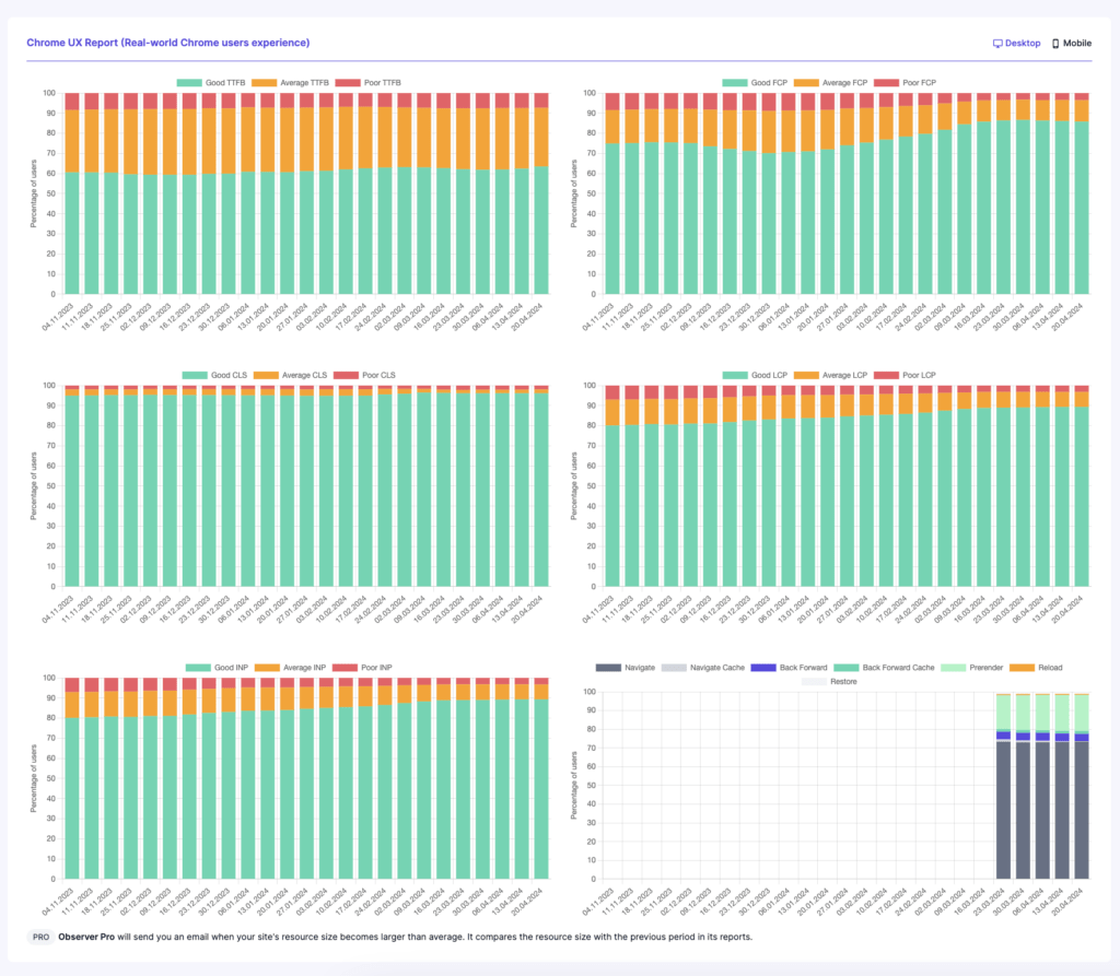
The Chrome User Experience Report (CrUX) provides a visually intuitive way to understand how real users interact with websites across the globe. The report utilizes charts to represent user experience data effectively, making it accessible even for those not deeply versed in data analysis.
In the CrUX charts, two dimensions are particularly important:
- The X-Axis represents grouped date ranges, typically organized monthly. This arrangement helps in tracking performance trends over time, allowing website owners to observe improvements, declines, or seasonal variations in user experience.
- The Y-Axis measures the percentage of users, scaling from 0% to 100%. This scale quantifies the proportion of all observed users, providing a clear picture of overall user satisfaction.
Each bar in the chart is color-coded to signify different levels of user experience:
- Green Sections: These parts of the columns represent users who have experienced a good level of user satisfaction. A larger green section indicates that a significant portion of users finds the website performs well, suggesting effective site optimization and fast response times.
- Orange Sections: These indicate an average user experience. Users in this category may face occasional performance issues or delays, which could suggest areas where improvements could be made.
- Red Sections: The red parts of the columns denote a poor user experience. A prominent red section is a critical indicator that many users are dissatisfied with the performance, possibly due to slow loading times or frequent interruptions, which might require immediate attention.
By analyzing these color segments over the chart’s timeline, web developers and marketers can pinpoint specific periods where user experience varied significantly. This insight allows for targeted optimizations and informed decision-making to enhance overall site performance and user satisfaction. Through this comprehensive visualization, the Chrome UX Report provides an invaluable tool for understanding and improving the real-world experiences of website visitors.
How to evaluate what is Good and Poor in the Chrome User Experience Report
Understanding the color-coded sections of the Chrome UX Report is crucial, but knowing what percentages to aim for can guide your optimization efforts effectively. In the realm of web performance, defining “good” or “average” experiences can vary depending on industry standards, target audience, and specific website functionalities. However, some general benchmarks can serve as useful guidelines.
What is a Typical Good User Experience Rates
Typically, aiming for at least 75% of user interactions falling into the green section is considered excellent. This indicates that the majority of your users are having a positive experience with fast load times and responsive interactions on your website. Achieving and maintaining a high percentage in the green can significantly enhance user satisfaction and retention. It is also critical to keep the percentage of interactions in the red section below 5%. A higher percentage in this range indicates that a substantial number of users are experiencing unacceptable load times and responsiveness, which could severely impact user satisfaction and retention.
Target Setting
Realistic targets depend on your starting point. If your current data shows less than 50% of interactions in the green, setting a short-term goal to move into the 50-74% range could be a viable initial step. For sites already achieving this, the goal should be to push as much of the user experience into the green as possible, ideally surpassing the 75% mark.
Metrics of the Chrome User Experience Report
The Chrome User Experience Report (CrUX) provides valuable metrics that help understand how real users experience your website. Here’s a brief overview of key metrics:
- TTFB (Time to First Byte): This metric measures the time from the user’s request to when they receive the first byte of the page. It’s an essential indicator of server response time and initial network latency.
- FCP (First Contentful Paint): FCP marks the time at which the first text or image is painted on the screen. It’s crucial for assessing how quickly the content begins to appear to the user, which is a vital part of the perceived speed of your site.
- CLS (Cumulative Layout Shift): CLS measures the sum total of all individual layout shift scores for every unexpected layout shift that occurs during the entire lifespan of the page. A high CLS indicates a visually unstable site, which can frustrate users and hinder user experience.
- LCP (Largest Contentful Paint): LCP measures the time it takes for the largest content element on the page to load. This could be a large image or video. It’s an important metric for understanding how long it takes for a page to load to a point where it’s useful to the user.
- INP (Interaction to Next Paint): INP measures the responsiveness of a page by calculating the delay between a user interaction and the subsequent visual response or update. It’s critical for assessing the interactivity and smoothness of the user experience.
- Navigation Types: This aspect of CrUX distinguishes between different types of navigational actions users can take, such as navigating to a page via a link, typing a URL directly, or using browser navigation buttons. Understanding these types helps to analyze how users are arriving at and interacting with your site.
With the integration of the Chrome User Experience Report into Observer, you’re not just monitoring your website’s performance—you’re setting the stage for tangible improvements. By leveraging real user data, Observer enables you to make informed decisions that directly enhance user satisfaction and optimize overall site performance. Ready to transform how you interact with your digital audience? Register Now and take the first step towards a superior user experience.

Managing multiple websites can be a daunting task, especially when it comes to ensuring their health and performance. In this blog post, we’ll explore the common problems faced in website management and how Observer can help you solve them.

Discover the hidden truths behind SEO that can transform your website’s performance.

In this blog post, we’ll dive into the world of web hosting. Understanding your options and knowing how to choose the right type of hosting for your website are crucial steps in managing a successful online presence.
Select free plan to meet or have a powerful assistant that includes all our features.